Email Accessibility: Most of Your Emails Exclude 16% of People
By Chris Stefaner, Co-founder of Swizero
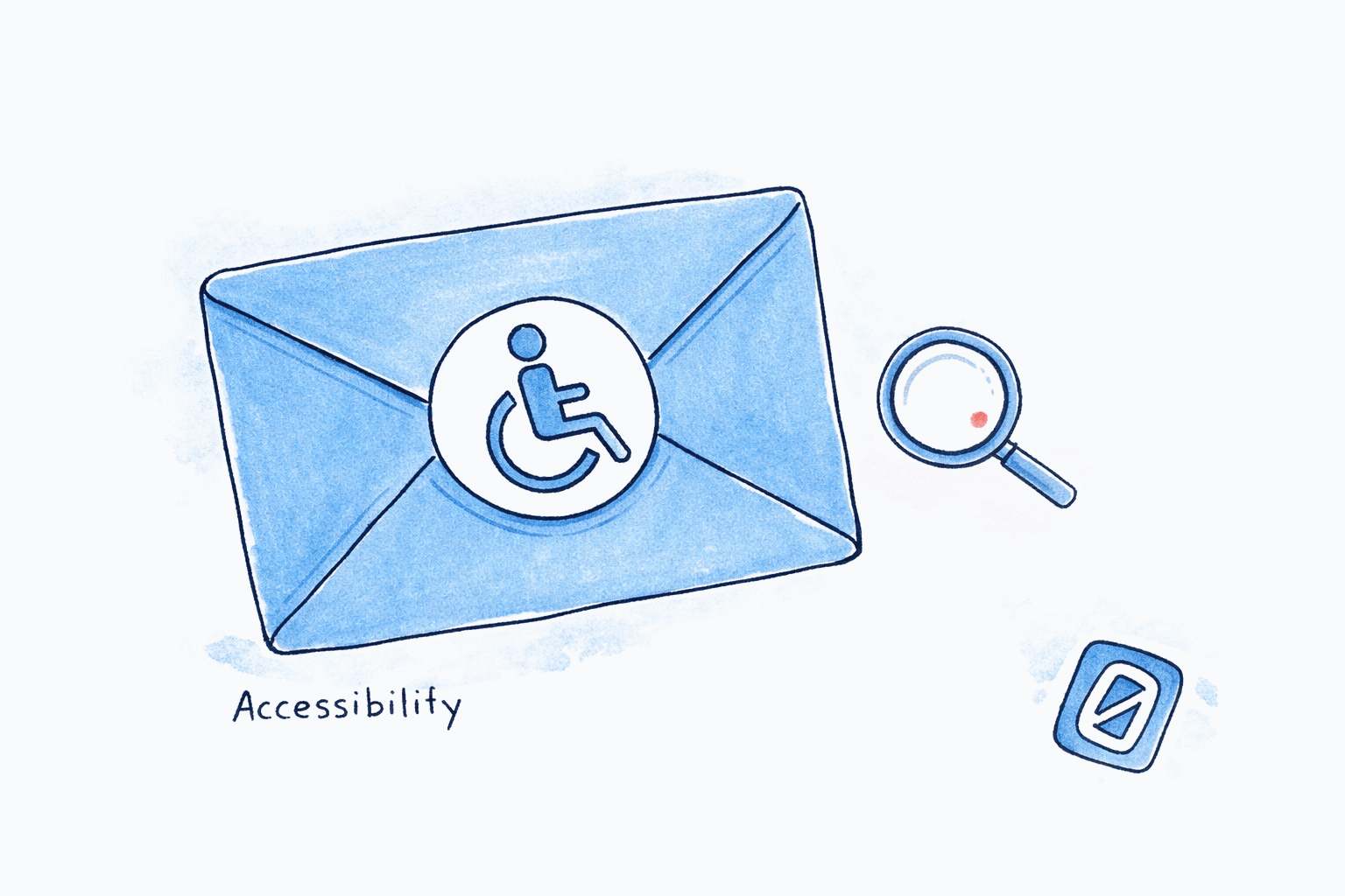
Nearly every HTML email you send is broken for someone. The Email Markup Consortium’s 2025 Accessibility Report tested 443,870 emails across industries and languages. The result: 99.89% contained accessibility issues classified as “Serious” or “Critical.” Only 21 emails in the entire dataset passed all checks, and they were written by a single author representing two brands.
That number sits alongside another one. The World Health Organization estimates that 1.3 billion people, 16% of the global population, experience a significant disability. When your emails fail basic accessibility standards, you are not dealing with edge cases. You are excluding roughly one in six recipients from reading what you wrote.
Here is the position this post takes: email accessibility is not a design trend or a compliance checkbox. It is a communication failure that most senders do not know they are committing, and the fix is simpler than they expect.
Key Takeaway
99.89% of HTML emails fail accessibility checks, and 16% of the global population lives with a disability that affects how they read digital content. Email accessibility is not about niche compliance; it is about whether your message actually reaches the people you sent it to.
Who Are the 16%? Understanding the Audience You Are Missing#
Email accessibility starts with understanding who you are excluding. The disability spectrum relevant to email is broader than most people assume. It spans vision, cognition, motor control, and neurodivergence, and the numbers are substantial.
Vision impairment affects at least 2.2 billion people worldwide, according to the WHO. That includes 43 million people living with blindness, 295 million with moderate-to-severe distance vision impairment, and hundreds of millions more with mild or near-vision loss. Many of these individuals rely on screen readers, magnification software, or high-contrast display settings to read email.
Color vision deficiency (color blindness) affects approximately 1 in 12 men and 1 in 200 women, roughly 5% of the global population. The most common form, deuteranomaly, makes it difficult to distinguish red from green. If your email uses color alone to convey meaning (red text for urgency, green buttons for “go”), a significant portion of your audience misses the signal entirely.
Dyslexia affects 10 to 20% of the population globally, according to the Yale Center for Dyslexia & Creativity. For these readers, serif fonts, justified text, and long unbroken paragraphs create measurable reading difficulty. A 2012 study by Luz Rello and Ricardo Baeza-Yates using eye-tracking with 48 dyslexic participants found that sans-serif, monospaced, and roman font styles significantly improved reading performance over serif, proportional, and italic fonts.
Motor impairments affect people with conditions ranging from arthritis to Parkinson’s disease to repetitive strain injuries. These users navigate email with keyboards, switch controls, or voice input rather than a mouse. WCAG 2.2 requires pointer targets of at least 24x24 CSS pixels, though the Nielsen Norman Group recommends 44x44 pixels as a best-practice minimum. Tiny “unsubscribe” links and cramped navigation buttons fail these users entirely.
| Condition | Estimated Affected Population | Primary Email Barrier |
|---|---|---|
| Blindness / severe vision loss | 338 million (WHO) | No alt text, broken heading structure, missing lang attribute |
| Color vision deficiency | ~350 million globally | Color-only meaning, low contrast ratios |
| Dyslexia | 700 million to 1.6 billion | Serif fonts, justified text, dense paragraphs |
| Motor impairments | 75+ million (WHO physical disability) | Small touch targets, no keyboard navigation |
| Cognitive disabilities | ~1 billion globally | Complex layouts, information overload, unclear hierarchy |
What Does a Screen Reader Actually “See” in Your Email?#
Screen readers like JAWS, NVDA, and VoiceOver parse HTML email from top to bottom, converting visual layout into a linear stream of spoken text. According to the WebAIM Screen Reader User Survey #10 (2024), 71.6% of screen reader users navigate pages using headings, making heading structure the single most important navigational aid.
Here is what goes wrong. The Email Markup Consortium found that 96% of tested emails omit the lang attribute, which tells the screen reader what language to use for pronunciation. Without it, a screen reader may attempt to pronounce French email content with English phonetics, or stumble through a German subject line with Japanese speech patterns. The report noted that if every email declared language settings, it would eliminate three of the five most common accessibility failures.
Layout tables compound the problem. Many HTML emails use table-based layouts for visual formatting, a holdover from the early 2000s. Screen readers like NVDA in Outlook announce table boundaries continuously, reading “table with 3 columns, row 1 of 7” before every piece of content. For a visually designed newsletter, the screen reader user hears structural noise instead of the actual message.
I could write an entire post about the state of alt text alone, but the key point is this: when images lack descriptive alt text, screen reader users hear “image” or nothing at all. Decorative images should use empty alt attributes (alt="") so screen readers skip them. Informational images need concise, meaningful descriptions. Most email senders get both wrong.
“Now that the Internet plays such a critical role in the personal and professional lives of Americans, excluding disabled persons from access to covered entities that use it as their principal means of reaching the public would defeat the purpose of this important civil rights legislation.” — Haben Girma, disability rights advocate and first deafblind graduate of Harvard Law School
Does Color Contrast Actually Matter That Much?#
Yes. Low contrast text was the most commonly detected accessibility issue in the WebAIM Million 2025 analysis, appearing on 79.1% of the one million homepages tested. Email is worse: the same design patterns that fail on websites get embedded into HTML emails and sent to millions of inboxes daily.
WCAG 2.1 Success Criterion 1.4.3 requires a minimum contrast ratio of 4.5:1 for normal text and 3:1 for large text (18px bold or 24px normal). The math is straightforward, but the failures are everywhere. Light gray text on a white background, a common design choice for “elegance,” often lands at a 2:1 or 3:1 ratio. That is technically invisible to millions of people with low vision.
Color-only meaning is a separate problem. Consider a dashboard email that marks overdue tasks in red and completed tasks in green. For someone with protanopia or deuteranopia, both colors may appear as similar shades of brown or olive. Section 508 and WCAG 1.4.1 both require that color never be the sole means of conveying information. Add icons, text labels, or patterns alongside color cues.
Most Common Accessibility Failures (WebAIM Million 2025)
Source: WebAIM Million 2025 Report
One caveat worth noting: the WebAIM Million studies websites, not emails. But email design borrows heavily from web patterns, and the Email Markup Consortium data confirms similar failure rates. The overlap is not speculative.
If designing accessible email feels like another burden on top of an already overwhelming inbox, Swizero approaches the problem from a different angle: instead of asking you to fix every message you send, it reduces your inbox to a fixed card limit of AI-ranked cards with plain-language summaries, so the cognitive load of reading email drops for everyone.
How Should You Design Emails for Dyslexia and Cognitive Accessibility?#
Dyslexia-friendly design benefits every reader, not just the 10 to 20% with a formal diagnosis. The principles overlap almost entirely with what makes email easier to scan and process for anyone under cognitive load, which, if you have read about the science of email overload, describes most people checking their inbox.
The British Dyslexia Association recommends sans-serif fonts with open counters, consistent letter height, and generous character spacing. Their recommended fonts include Arial, Calibri, Century Gothic, Verdana, and Tahoma. The Rello and Baeza-Yates study confirmed this with eye-tracking data: italic fonts increased fixation duration (a proxy for reading difficulty) compared to roman styles.
Practically, this means:
- Use sans-serif fonts at 16px or larger. This single change improves readability for dyslexic readers, low-vision users, and mobile readers simultaneously.
- Left-align text. Never justify. Justified text creates uneven word spacing that disrupts reading flow for dyslexic readers. Research on better email writing confirms that left-aligned text improves scan speed for all users.
- Keep paragraphs to 2 to 3 sentences. Dense text blocks increase cognitive load. Breaking content into smaller chunks with clear headings gives the brain natural rest points, something Gloria Mark’s research in Attention Span (2023) connects to reduced stress and better information retention.
- Use line height of 1.5x the font size. Cramped line spacing causes line-skipping, a specific problem for dyslexic readers.
- Avoid all-caps for emphasis. Screen readers may interpret all-caps text as acronyms and spell each letter individually. Use bold or larger font size instead.
“By designing with accessibility in mind, we are designing for our friends, families, and future selves.” Alistair Duggin, Head of Accessibility, UK Government Digital Services
Honestly, the dyslexia-friendly design recommendations surprised me the least while researching this piece. They are identical to what any readability expert would recommend. Email accessibility and good design converge completely here.
What About Plain Text vs. HTML? Is Simpler Always Better?#
Plain text email is inherently more accessible than HTML in several ways. Screen readers process it without hitting layout table noise, it renders consistently across every email client, and it avoids the color contrast and image alt-text problems that plague HTML emails. For professional closings and sign-offs, plain text often feels more personal too.
But plain text has real limitations. It cannot convey document structure through headings, which 71.6% of screen reader users rely on for navigation. It cannot provide semantic emphasis (bold, italic) that helps sighted and assistive-technology users distinguish key information. And plain text cannot include data tables, which some communications genuinely require.
The practical answer for email accessibility is not “choose one.” It is “send both.” Multipart MIME email includes both an HTML version and a plain-text fallback. Email clients select whichever version the user prefers or their assistive technology handles better. This approach gives you the design flexibility of HTML while providing a clean fallback for users who need it.
For the HTML portion, the Email Markup Consortium recommends:
- Include the
langattribute (missing from 96% of emails) - Include the
dir(directionality) attribute (missing from 98% of emails) - Use semantic HTML: real headings (
h1throughh3), not styleddivorspanelements - Ensure a logical reading order that matches the visual layout
- Test with at least one screen reader before sending
The 2025 report found that only one email client out of 44 tested supports all HTML and CSS accessibility features. That is not a reason to give up on HTML email. It is a reason to build in progressive enhancement, designing emails that degrade gracefully when an email client strips features.
Why Does Email Accessibility Matter Legally?#
This is no longer a voluntary best practice. The regulatory landscape shifted significantly in 2025 and continues tightening.
The European Accessibility Act (EAA) took effect on June 28, 2025, requiring any organization that communicates with EU consumers through digital channels to meet accessibility standards aligned with EN 301 549 and WCAG 2.2 AA. That explicitly includes email. Transactional emails, order confirmations, password resets, and customer service communications must all be readable by assistive technologies. Non-compliance carries financial penalties.
In the United States, Section 508 of the Rehabilitation Act requires federal agencies to make all electronic communications accessible. The 2024 Department of Justice ruling under Title II of the ADA extended web and mobile accessibility requirements, and courts have increasingly treated email communications as covered under these mandates.
The financial argument is equally direct. People with disabilities represent $1 trillion in annual disposable income in the United States alone. Organizations that send inaccessible emails are not just risking fines. They are losing revenue from an audience that wants to engage but cannot.
For anyone managing email productivity at a professional level, accessibility awareness is becoming table stakes. It is not a nice-to-have skill anymore.
A Practical Email Accessibility Checklist#
The following checklist covers the highest-impact changes, ordered by effort-to-impact ratio. You do not need to implement all of these at once. Start with the first three, which address the failures the Email Markup Consortium found in nearly every email tested.
| Priority | Action | Who It Helps | Effort |
|---|---|---|---|
| 1 | Add lang attribute to HTML | Screen reader users (96% of emails lack this) | 5 seconds |
| 2 | Write meaningful alt text for images | Blind and low-vision users | 1 min per image |
| 3 | Ensure 4.5:1 contrast ratio for text | Low-vision users, color blind users, mobile readers | Use a checker tool |
| 4 | Use sans-serif fonts at 16px+ | Dyslexic readers, low-vision users, everyone | CSS change |
| 5 | Left-align text, avoid justification | Dyslexic readers | CSS change |
| 6 | Add text labels alongside color cues | Color blind users | Design update |
| 7 | Make buttons/links 44x44px minimum | Motor-impaired users, mobile users | Layout change |
| 8 | Use semantic headings (h1, h2, h3) | Screen reader users who navigate by heading | HTML change |
| 9 | Include plain-text multipart fallback | All assistive technology users | Template update |
| 10 | Test with a screen reader | Everyone | 15 min per email |
Swizero takes an architectural approach to this problem on the receiving end. Instead of expecting every sender to fix their formatting, Swizero’s AI summaries distill each email to its core message in plain language, reducing the dependency on how well the original email was formatted. Paired with a fixed card limit that caps cognitive load per session, the result is an inbox that works better for everyone, including people whose email habits are shaped by the mental health effects of constant digital communication.
Frequently Asked Questions#
What percentage of emails fail accessibility standards?#
According to the Email Markup Consortium’s 2025 Accessibility Report, 99.89% of the 443,870 HTML emails tested contained “Serious” or “Critical” accessibility issues. Only 21 emails passed all checks. The most common failures were missing language attributes (96% of emails), missing directionality attributes (98%), and insufficient color contrast.
Do screen readers work with HTML email?#
Screen readers can process HTML email, but the experience varies significantly by email client. The Email Markup Consortium found that only 1 of 44 email clients tested supports all HTML and CSS accessibility features. Screen readers rely on semantic HTML (headings, alt text, lang attributes) to parse email content. Layout tables, missing headings, and absent alt text degrade the experience to the point of unusability for many blind and low-vision users.
What is the minimum color contrast ratio for accessible email?#
WCAG 2.1 Success Criterion 1.4.3 requires a minimum contrast ratio of 4.5:1 for normal-sized text and 3:1 for large text (18px bold or 24px regular). Many popular email design choices, such as light gray text on white backgrounds, fail this threshold. Free tools like the WebAIM Contrast Checker can verify your ratios in seconds.
How does dyslexia affect email reading?#
Dyslexia affects 10 to 20% of the population and makes reading more effortful, particularly when text uses serif fonts, justified alignment, small font sizes, or tight line spacing. Research using eye-tracking technology found that sans-serif, roman-style fonts at 16px or larger with 1.5x line height significantly improve reading performance for dyslexic readers.
Is email accessibility legally required?#
In many jurisdictions, email accessibility is a legal obligation, not just a best practice. The European Accessibility Act (effective June 2025) requires digital communications including email to meet WCAG 2.2 AA standards for organizations serving EU consumers. In the United States, Section 508 requires accessible electronic communications from federal agencies, and courts have increasingly applied ADA requirements to commercial email. The trend toward enforcement is accelerating, not slowing.
What is the fastest way to improve email accessibility?#
The single fastest email accessibility improvement is adding a lang attribute to your email’s HTML tag. This five-second change eliminates three of the five most common email accessibility failures identified by the Email Markup Consortium. After that, add meaningful alt text to images and verify your text meets the 4.5:1 contrast ratio. These three changes address the vast majority of critical issues.
Sources#
- Accessibility Report 2025 | Email Markup Consortium, 2025. 99.89% of 443,870 HTML emails tested contained serious or critical accessibility issues.
- Disability and Health Fact Sheet | World Health Organization, 2024. 1.3 billion people (16% of global population) experience significant disability.
- Blindness and Visual Impairment Fact Sheet | World Health Organization, 2024. At least 2.2 billion people have a vision impairment.
- Screen Reader User Survey #10 Results | WebAIM, 2024. 71.6% of screen reader users navigate using headings.
- The WebAIM Million 2025 | WebAIM, 2025. Low contrast text found on 79.1% of the top 1 million homepages.
- Good Fonts for Dyslexia: An Experimental Study | Rello & Baeza-Yates, 2012. Sans-serif, monospaced, roman fonts improved reading performance for dyslexic participants.
- Understanding Success Criterion 1.4.3: Contrast (Minimum) | W3C, WCAG 2.2. Minimum 4.5:1 contrast ratio for normal text.
- Understanding Success Criterion 2.5.8: Target Size (Minimum) | W3C, WCAG 2.2. Minimum 24x24 CSS pixel touch targets.
- EU Accessibility Act and Email | Mailjet, 2025. EAA requires accessible digital communications including email from June 2025.
- IT Accessibility Laws and Policies | Section508.gov. Federal requirements for accessible electronic communications.
- Web Accessibility Statistics: The Impact of Disabilities | AllAccessible, 2025. People with disabilities control $1 trillion in US annual disposable income.
- Dyslexia FAQ | Yale Center for Dyslexia & Creativity. 10-20% of the population affected by dyslexia.
- Accessibility in Plain Text Email | Parcel. Guidance on multipart MIME email for accessibility.
- Keyboard-Only Navigation for Improved Accessibility | Nielsen Norman Group. Touch target and keyboard accessibility best practices.
- The Email Finish Line: Why 34% Beat 19% Every Time | Swizero, 2026. Research on bounded vs. unbounded inbox models.
Your inbox doesn't have to feel like this.
Be among the first to experience a finished inbox.
Join the finite inbox beta